Showing posts with label graphic design. Show all posts

Sunday, February 18, 2007

In search of a new logo

We need a new logo. We've held meetings, drawn funny pictures on scraps of paper in the office, smacked our foreheads in frustration, and given each other supportive, friendly slaps on the back. But we've still got basically nothing. Here are the problems with choosing a logo:

1) Do we want to emphasize the regional nature our title suggests, or do we want to suggest that we are more than just southernmost Hoosiers, and that while we strive to be the "voice of the Heartland" (doesn't Tom Petty already do that anyway?), our scope and view is much broader than that? How do we say both? Do we want to say both? Do we want to say either?

2) A logo: a single, simple image that sums up an entity. What can do that in this case? A leaf? A bird? A salad fork? A turtle with a top hat? What does any of this have to do with literature, or with Southern Indiana, or with us? How does anyone ever decide on a logo?

3) Must literature always be represented by leaves and trees and fountain pens? Are we earthy? Have any of us ever used a fountain pen, and so what if we have? Can literature not also be represented by a turtle with a top hat, or by a dancing bear, or by a car in flames?

In addition to my duties for SIR, I also run an online literary venture at www.theedwardsociety.com. It's been dormant for a long time now, shoved to the bottom of several piles of seemingly more important things. But I bring it up to illustrate (no pun) how arbitrary and meaningless a logo can be, while still doing a fine job. I chose, for no reason at all, to place a bird on a bald man's head and stick it at the top of every page. It looks like this


and it has been well received. People have offered their own interpretations, none of which ever occurred to me. For SIR, here's what we've done so far:


What do each of these say about us? How can we ever decide?

Friday, February 16, 2007

Things Need to Look Nice

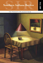
Among the problems we try to solve here at SIR headquarters is the ongoing problem that Things Need To Look Nice. We're constantly designing things: chapbook and SIR covers, posters, a table layout for the upcoming AWP conference, a new website, and a new SIR logo. In nature, plants and animals are born and they grow naturally into aesthetically-splendid things, but in the artificial world of literary publishing (despite all of the parent-child metaphors writers love to use for their relationship to their work), everything is faceless and without personality until we have sat for days in front of a bright screen, manipulating lines and text until our eyes are puking.

We're amateurs at this, of course. It takes us entirely too long, and the revision process is grueling. I hesitate to put a percentage on the amount of our office time that goes into graphic design - a thing we never claimed to be qualified for (Well, I once did, and faked it well enough to land a job as a graphic designer/web programmer in New York City, but that's another story that ends just as pathetically as it begins...), but it's somewhere around 100%. It's almost all we do. Editors, ha! Let's be honest here. We're underqualified, overworked, graphic designers.

- Chris Dickens, Associate Graphic Designer for the Southern Indiana Review