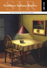
1) Do we want to emphasize the regional nature our title suggests, or do we want to suggest that we are more than just southernmost Hoosiers, and that while we strive to be the "voice of the Heartland" (doesn't Tom Petty already do that anyway?), our scope and view is much broader than that? How do we say both? Do we want to say both? Do we want to say either?
2) A logo: a single, simple image that sums up an entity. What can do that in this case? A leaf? A bird? A salad fork? A turtle with a top hat? What does any of this have to do with literature, or with Southern Indiana, or with us? How does anyone ever decide on a logo?
3) Must literature always be represented by leaves and trees and fountain pens? Are we earthy? Have any of us ever used a fountain pen, and so what if we have? Can literature not also be represented by a turtle with a top hat, or by a dancing bear, or by a car in flames?
In addition to my duties for SIR, I also run an online literary venture at www.theedwardsociety.com. It's been dormant for a long time now, shoved to the bottom of several piles of seemingly more important things. But I bring it up to illustrate (no pun) how arbitrary and meaningless a logo can be, while still doing a fine job. I chose, for no reason at all, to place a bird on a bald man's head and stick it at the top of every page. It looks like this

and it has been well received. People have offered their own interpretations, none of which ever occurred to me. For SIR, here's what we've done so far:
What do each of these say about us? How can we ever decide?


No comments:
Post a Comment